My wife has a soft heart. Every, single, &$*% time she sees a lemonade stand on the side of the road she stops.
Sometimes, she gets a good deal – $0.25 for a nice cup of cold, sweet yummyness (yes, I’m a dad so that is a word). Other times, she spends $1.00 or more for 2 ounces of watered down “what the heck is that?”
In the end, the transaction is less about us being happy. The actual value is in how wide the kids’ smiles are when we leave. Literally, sometimes, you can hear the boom of ‘YES! WE SOLD ONE!’ across the town as we go from some change in our pockets to a cold cup.

An interesting thing happened on the way home…
One day, our normal, daily weekend practice of trying to get home without stopping at a lemonade stand started. I was trying to ignore those little signs, and those shouting sales pitches.
“It’s the best!”
“C’mon, please buy some lemonade.”
‘Nope, not going to stop today,’ I confirmed with myself.
We were a half-mile from home, when I stopped at a stop sign; like you do. When I noticed that this particular lemonade stand was a little different. The stand didn’t have the standard “Lemonade = $0.50” or something similar. Instead it said this…
Stop and buy your own cup of sunshine – $1.00
YES!
This young lady created a CTA for her lemonade stand! It was clear, simple and directed your action. Plus, it was intriguing – “sunshine”, not lemonade. After all, you were buying happiness (something we ALL need), and not just a drink.
As we walked over, her setup was simple. She didn’t have multiple cups out, filled with ice melting and diluting the lemonade, she instead, had three cup sizes next to her. When we walked up, she greeted us and asked us if we wanted some lemonade.
“Of course,” my wife said with a smile.
“How much sunshine would you like in your day, ma’am,” the little girl responded without missing a beat.
‘ALL OF IT!’ I thought. This kid was a salesperson without the sales experience.
Her conversions were simple. A 4 ounce cup was $0.75, an 8 ounce cup was $1.00 and a 12 ounce cup with ice was $2.00. And, and, each cup had a statement on it. The smallest said ‘a little smile’, and the largest was ‘smiles all day’ or something like that.
What?! This young girl had multiple levels of sales to convert ANYONE stopping. She sold solutions; more sunshine and happiness in your day. Plus you knew exactly what you were buying.
And she was only 9.
What does this have to do with lead generation and marketing in the insurance industry?
Simply put, she was doing more with marketing and lead generation on her scale than anyone else in this city and possibly state. Relatively speaking, she likely was selling, and upselling, more units that your total policy count every afternoon.
Her lead generation was simple, and very clear. Her marketing was solution-based, not product or service based.
The sales happened after she got the traffic from her lead generation and marketing efforts.
And after a week, we came back to an even more optimized sign.
Could you be doing something similar?
Every business’s website should be a lead generation website. Your website is a central piece of converting the public to a paying customer. You convert for calls. You convert for emails. Even deeper links into your website could be thought as conversions.
Because of this, even small changes could mean big changes for your bottom line.
Insurance marketing and lead generation: A simple thought
Before we start, I want to make this clear…
Your insurance agency website, your digital and online marketing, and your brand in general, can always be better at lead generation.
Really, this is true of any small business or corporation. Your website, along with other marketing and advertising efforts, can grow. Even small changes can yield 20%+ increases in lead generation (I’ll show you how later).
How do insurance lead generation and insurance marketing relate?
Lead generation is the act of creating marketing and advertising with the express goal of turning a visit of some type into a lead for a business. With the online world, this is usually done by targeting people that are possible customers by region or income. Then, giving a them a target to answer their need. You then introduce your brand as the answer, and you have a lead.
Marketing works nearly the same way. However, new leads are not necessarily the goal of marketing. Instead, you will likely focus on brand awareness, reputation management, visibility and, of course, getting customers.
The point is this – both act, in different ways, of generating revenue for your business.
The goals are the only difference.
Hey guys…let me show you somethin’!
To show you better how to perform fast and affordable insurance lead generation and insurance marketing, we’re going to cover some examples. I randomly pulled local insurance agents and insurance agencies from New Castle.
Quick disclaimer about the data below. I do not have an association to these brands, nor does their inclusion promote my endorsement for these brands. These examples of changes are not under contract, but instead, suggestions. Your distance will vary.
Also, I’m not stating any of these businesses are poor, bad or otherwise. The companies and their websites that you will see have been in business for years. They are licensed, reputable and are upstanding. I just want them all, like your own brand, to be better.
With that out of the way, let’s look at some local insurance agents and how they get some powerful results.
Creating more leads on your website
Leads grow from one thing – answering a need. If you build your content and your marketing around filling the needs of the public, then you will not run out of customers.
As well, do not think lead generation is a zero-sum game. You will NEVER run out of new, potential clients. With proper digital marketing and lead generation, you’ll never run out of new traffic that you can convert.
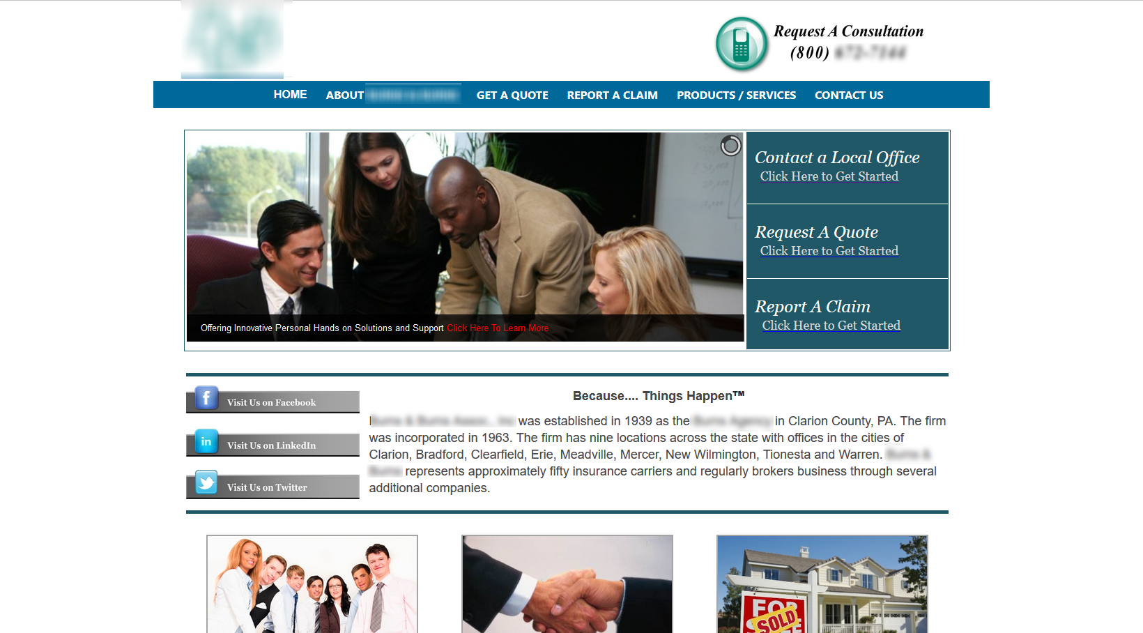
Insurance agency #1 – dated design and no real lead generation
The first domain that we are going to look at has a few key needs addressed. Namely, there is a clear point of contact for phone numbers.
What is missing?
Focus points. We need a “next action” to happen that matches the layout, but to also focus on converting by contrast. Think of a button that matches the design of the website, but draws your eyes over.
There are CTA (call to action) buttons on the website. However, they are hidden. In fact, there are three buttons that direct users to contact this company for various reasons – let me highlight them for you.
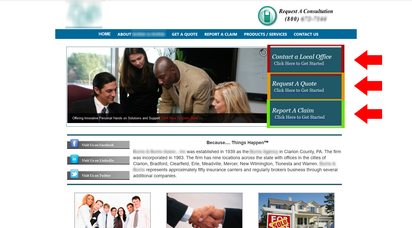
The issue with these are that they are sending separate messages. Do you want users request a quote? Is the website looking to get people to contact them for insurance answers? Is the main goal of the page to start a claim?
The page needs a single, specific conversion goal. Likely, it is calling for a quote.
Initial changes to the website’s designs
The goal of an insurance website is to get people to call. If they do not call, the secondary is to get people to email (directly or via a contact form).
The phone number is in the header, but it is plain text, and the same color as all the other text on the page. The CTA buttons match the color of the rest of the brand. So where do we start?
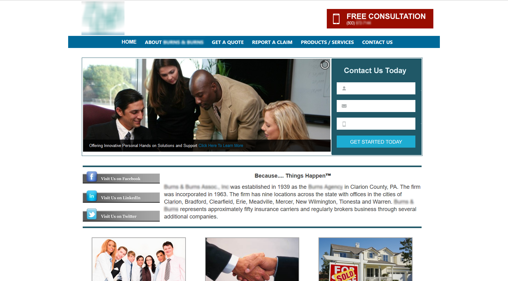
Above, you can see we changed only a few elements.
First, we made very clear the initial and clear CTA of the homepage – to call use for a free consultation. You can try out variants like ‘Call Now’, ‘Free Quote’ or whatever works best. The point of this change, though, is less about the text, and more about the action plus the contrast and clarity of the CTA.
The other large change is the introduction of a contact form. Gone are those unclear conversion elements. Instead, we have a clear section that absorbs new leads. They fill in their information and now become warm leads.
The final item that you might have noticed was that we edited the color of the link “Click here to learn more” from red (very high contrast on the page), to something matching the blue of the brand. The reason why this was done is that it wasn’t the main conversion element on the page.
And, there is more…
the image on this main page has a large issue. Namely, these people are looking away from what you want your main CTA to be (the phone call). Check it out…
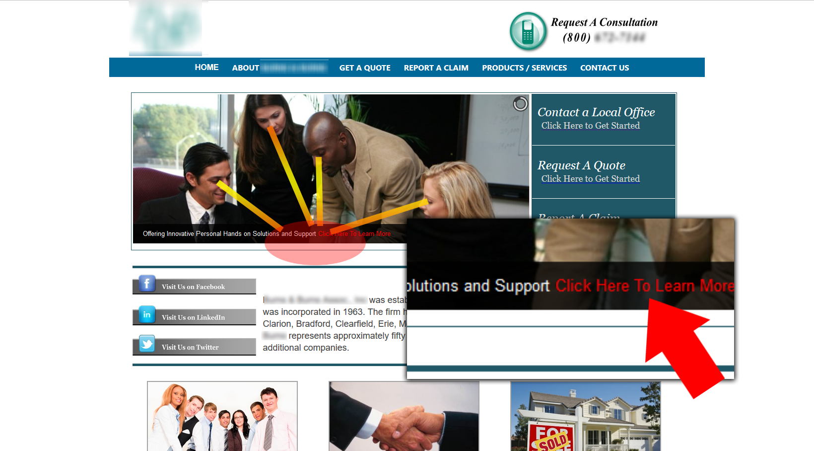
Where are they looking? Down…at that link. What do people look at in general? When someone sees an advertisement or image, we immediately look in the direction of what people are looking at.
This is why that particular image would not as effective as a single or two people looking to the right. The might even be looking up and to the right.
Final changes for better conversions
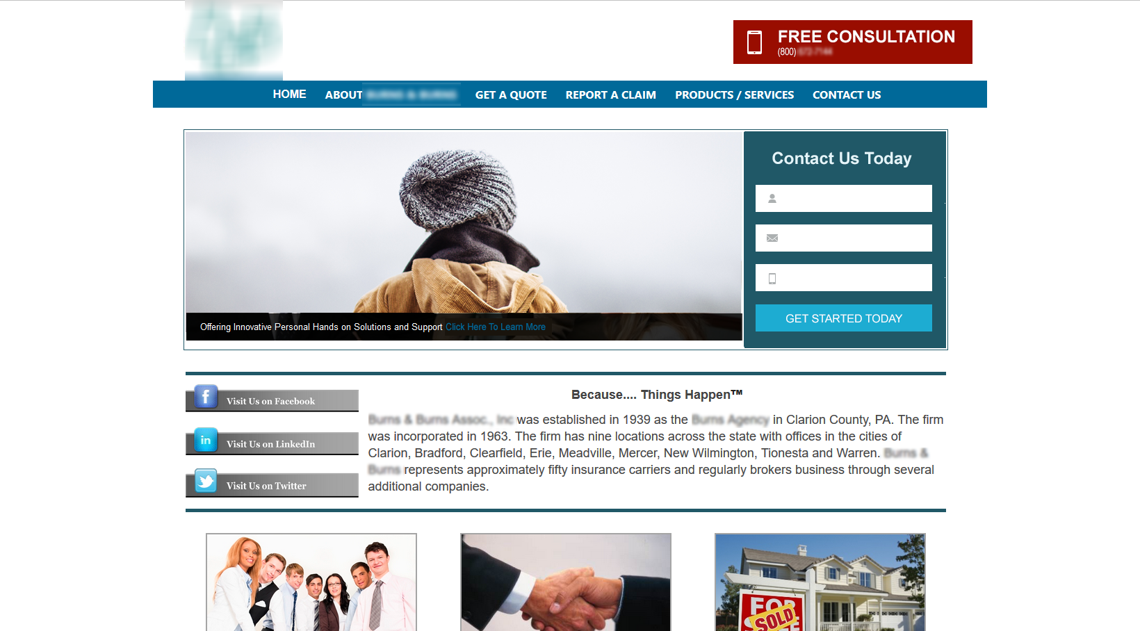
Notice the differences?
Now you have contrasting conversion elements, as well as the main person on the page looking towards them. Visiting customers are now pointed in the direction of what to do next.
What changes did we make? And what are their impacts?
- created a CTA button for people to call
- created a contact form for people to email
- muted the “Click here to learn more”
- changed picture to direct the eye to CTAs
Further changes to this website
The best course of action here is to reinforce trust symbols and indicators. Using icons and logos from trusted insurance sellers and organizations can boost your authority instantly in visitors minds.
I would also edit the content and copy to match the requirement of this page – conversions. Direct users to deeper parts of the site, reinforce authority as New Castle insurance agent and then also provide answers.
The final thing that might be added is an optin to an insurance checklist; think for car insurance or life insurance. Not only is this simple to create, but you can gain a warm lead list of people looking for insurance solutions.
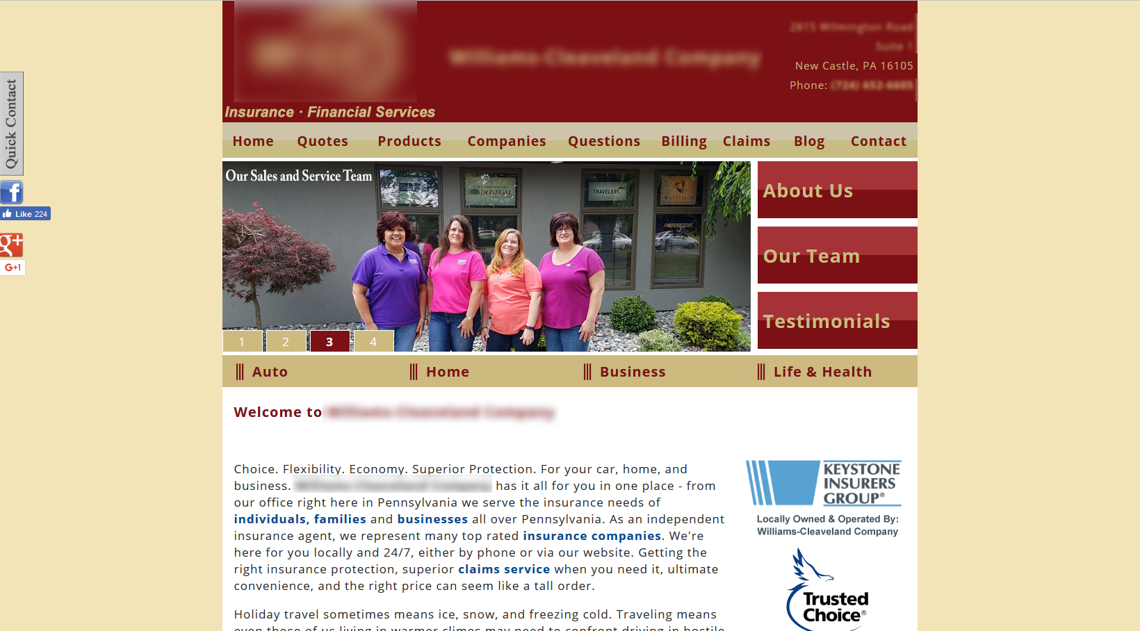
Insurance Agency Website #2 – dated design and no clear conversion path
My initial thoughts on this insurance agency was that their website is loaded with data. I’m not kidding – each insurer has their own page, as well as each contact. The various services have matching videos and there is a blog.
Initially, it looked good.
But reviewing the page gave me one major thought…
What does it want me to do?
The three buttons on the right hand were the closest to actionables that I had seen. Yes, there was a phone number, email and address. But there was nothing that clearly said ‘do this now’.
So, in the first iteration, I focused on calling and emailing – simple.
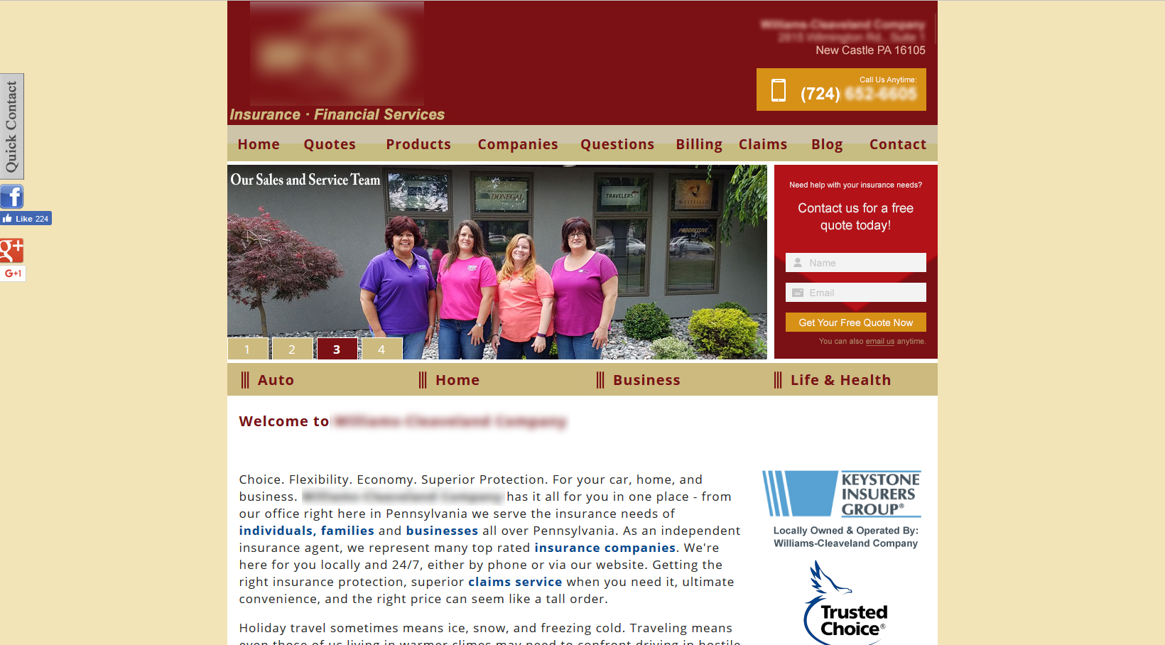
First changes – call, contact and click
As you can see, a call button was added. The color matches the layout of the website. But, and this is important, it contrasts with the design as well.
The next area that changes is the adding of the contact form. This is secondary to the initial call, however, it is a main focal point. I used the same coloring of the background for the form. At the top of the contact form, I used a main contrasting red with an arrow, creating ‘flow’.
What I would never change
Awesome, quality, real images. This brand uses real images of their employees and owners across the homepage and the website.
This is an invisible linking mechanism between the brand, empathy and potential customers. You are, as a visiting customers, seeing the people that are making the business into a business.
What I would change … today!
In a way, I was thinking this is a great resource to get information on insurance providers. There is a ton of information on insurance plans, and insurance answers. This is a great version of insurance marketing.
Then I did some digging…
The website, itself, is a templatized marketing website. Templates aren’t bad. However, this is templatized from a national company that focuses on the insurance agency. I found 4 websites from this marketing company that uses variations in colors, alone. I found 2 dozen that use similar styles of the layout (buttons here, intro information here, links like this, sublinks like that, etc.
Plus, there is an extreme issue with duplicate content on these sites. The service deploys the example same articles, with regional alterations (probably from a main template they use), and then posts this info. It isn’t fashioned for a specific market, and the content is not reliable in attracting users, visits and customers.
I also found that this isn’t limited to the marketing company mentioned. Many, many insurance agents use a similar strategy. However, the results are the same as using cold email and mailing lists across agents and agencies…they just stop working.
Check out this example I found at another insurance agency…
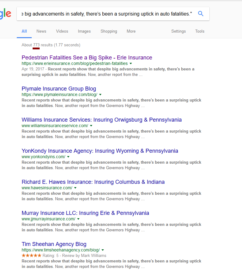
By the way, you are reading the above correctly. There are nearly 1000 identical website pages using the same text, the same content, in the same way.
Quick tip: the unoriginal gets hurt in Google Search.
Instead, use your blog and content correctly. Create unique and answer-filled (show your authority in your answer) content to new and existing customers. Make your website not just a nucleus for getting answers about insurance, but a hub of getting the BEST.
Further changes…
I took a few hours and put together a whole new layout for this website. It isn’t as refined as it could be, but it highlights the basics of the needs of an insurance lead generation website.
There are a lot of changes here.
First, every area of this insurance website layout focuses on converting. Seriously, each segment builds authority, tries to convert the user with a call or email, or directs them to get more information.
Next, the branding is evident, but the conversion elements are all clear. Buttons are buttons. Links are links. Direct CTAs are clear and obvious. Website navigation is just as clear.
Finally, this layout is current and not outdated. It does not look like a resource to gain information for New Castle, Lawrence County nor Western Pennsylvania residents. It clearly is in the business of insurance. And it clearly looks like the business is there for you, the customer.
Insurance Agency Website #3 – good changes, but still room to grow
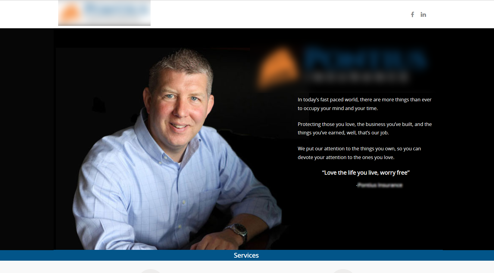
Insurance Agency Website #3 likely is the best looking website in the bunch of the pool I had in front of me. You can see that the website uses a template when I looked over it, but the intent is clear and the brand is front and center.
However, the only conversion elements were two icons for social media pages in the header. These were greyed out, and would force the user to use their possibly only action to leave the website – not good. If you want them to use one action, it is to call, right?
First change, and likely the only ones
The only changes I thought of here was:
- keep the branding, but condense it
- have a clear ‘call now’ CTA
- have a clear ‘contact us’ CTA
Three simple changes, right? Here is the newer version.
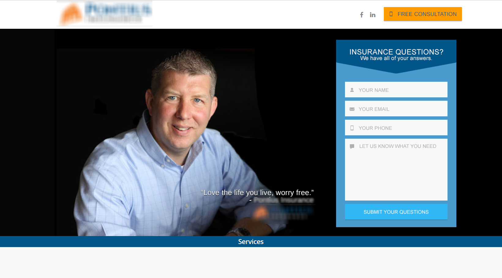
We first condensed the branding down this simple quote. This is the owner, giving a form of a mission statement. Simple and clear.
Next, the call button. The orange is contrast of the brand’s blue. It is in the header, and is instantly visible. I might not necessarily start with ‘free consultation’, but you can explore. Here are some suggestions for testing button text:
- Free Consultation
- Call To Start
- Call Now
- Free Quote
- Free 10-Minute Quote
- Call For A Quote
Finally, the contact form and why it works. The colors match the brand. The arrow give the subconscious ‘fill this out NOW’ statement. As well, the positioning of the owner’s image open to the form lets you know that a real person is helping you. That is a strong connection that a potential insurance customer has to the insurance company.
Further changes to this website
Constant content. It is that simple.
This brand can make use of constant content creation. Use quality subject matter – think really evergreen and regional and geographically specific. Then, mixing that content with various platforms.
A good content campaign mixes the subject with strong copywriting across social media platforms, email marketing, landing pages, paid advertising, video, images and the content on the blog. Offering content upgrades helps too – like white papers, case studies, checklists, guides and more.
What we learned about insurance lead generation and marketing
Today I covered a few local, insurance agencies in New Castle Pennsylvania. We looked at changes to their existing websites to create better insurance lead generation.
The primary factor of converting customers is matching their visit, to their needs and giving them a solution. You want qualified visitors coming into your website, who will then become warm leads, right? But they also need to qualify you as their solution just as fast.
This is furthered by allowing that fulfillment to be fast – click to call buttons, clear and early contact forms and emails, etc. In multiple cases, simply by providing a contact form in the header of a website, as well as a click-to-call button, you can do this.
We looked at three local websites, and some very basic changes they could perform to make more conversions occur. We also learned the ‘why’ behind each.
Insurance lead generation and insurance marketing is not something that website owners should not know at least a little about. Hopefully, today, you’ve experience a few ‘ah-ha!’ moments that will help your brand get better. And if not, contact me, anytime, and I can help.


